Showing posts with label scale. Show all posts

Sunday, June 2, 2013

Building a Better Second Life

Building a Better Second Life
Tips for squeezing both better performance and more detail
out of SL through efficiently made content.

 We all have our complaints about SL. The lag. The lack of visual fidelity. Poor framerates. The unreliable scripts. The lag. The expensive land. The lag!

 I'm sorry to say there is no "silver bullet" to solve these problems. There is no single problem LL can fix that will magic the lag away. That's reality, and it applies to the virtual world no matter how hard you click the heels of your no-mod ruby red slippers, with 600 resize/texture change/colour change scripts in each, together.

 However, there are little things you can do to alleviate these issues somewhat. They add up, so the more people who follow these tips, the better SL looks and runs for everyone.

Use fewer (and smaller) texture maps!

 This is a big one that few seem to consider.

 Textures eat up bandwidth to download, processing power for the sim to retrieve them from the asset server and deliver them to your viewer, and then your videocard needs to store them in memory and render them. Too many large textures are one of the biggest reasons SL gets such poor framerates and why everything takes so long to rez.

Here's some numbers for you, to help illustrate why slapping 1024x1024 textures on everything is bad;

64x64 : 16kb
128x128: 65kb
256x256: 262kb
512x512: 1MB!
1204x1024: 4MB!

 Most people only have 512MB of VRAM and Second Life refuses to use more than that for textures regardless.

 There is a really bad trend with mesh content. People using 1024x1024 textures on every surface, large and small. Often only utilizing small sections of these textures, the rest being unused data that you never see when looking at the object in-world. This is usually the result of applying the same texture to every surface in the 3D modelling program, using offsets for smaller surfaces, then baking shadows and exporting the full 1024x1024 textures even though the model only uses a small visible area.

 What you wind up with is something like this;
 A tiny bit of texture detail, huge area of unused black space. Additional texture detail is then added via multiple similar textures, usually at 1024x1024 resolution

 I've seen this on everything from houses to drinking cups. I bought a bar counter, basically a wooden box, which turned out to have eight unique 1024x1024 textures. In the same bar set was a tip jar, a small drinking cup with a sign reading "Tips" leaning against it. It used three 1024x1024 textures, a 1024x512 texture and a 512x512 texture. Everything in the set was like that. When I rezzed the set in an otherwise empty sim, my framerate dropped from 75fps to 5fps and remained that way until I removed all of the textures. With the geometry alone, my framerate shot straight back up to 75+.

 From another store I purchased a simple, one room house. Not counting the two windows and the single door, the house uses eighteen 1024x1024 textures. Realistically, this house could have been textured with no more than three 512x512 textures and looked more or less identical.

 Outside of the "Daikatana arrow" you never see texturing that inefficient in a videogame, and that is a part of why much prettier videgames run much more smoothly than SL. The performance impact of so many huge textures cannot be understated. This is why so many people experience poor performance in mesh-heavy environments. Mesh is great, low-poly builds allow for better performance than we could get from sculpts and prims, but overloading builds with too many huge textures extinguishes any performance gain.

 So how should texturing be done? More like this;

 Notice how the artist has combined as many elements as possible into a single texture, leaving very little unused black space. This reduces the amount of texture memory your creation eats up while also allowing you to maintain higher resolutions for your textures. The texture detail in the upper right corner is no less a resolution, but now we're using a single texture map instead of, potentially, upwards of six.

 Combine textures, use ALL the space in a texture map and wrap it around the visible surfaces of your mesh. There is no reason not to do this!

 And don't think this only applies to mesh! Those of you who work in prims and sculpts should also consider using fewer, smaller textures and wrapping textures around surfaces using texture offsets.

 A good rule of thumb, if a surface is smaller than 10x10m, use a 512x512 texture or smaller!   I'll get more into avatar textures when I get to draw weight but avatar attachments almost never need textures larger than 512x512 and rarely need textures even that large unless you're using a single texture on a mesh that covers your entire torso or lower body.
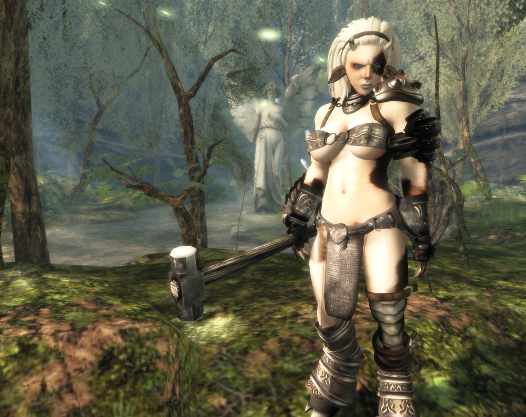
I've cut all the 1024x1024 textures and all but one or two of the
512x512 textures from my own avatar's attachments.
 Do you lose detail? Sure, but it's barely noticeable. The increased performance you gain, on the other hand, is substantial.

I've moved things around a bit and changes the trees to mesh since this screenshot.

 At my own fantasy build in Aleph (warning, it is an adult sim so you may encounter NSFW content there) I have used a variety of tricks to remove over sixty 1024x1024's worth of textures and saw my framerates jump from single digits to over 30fps in the worst areas. With shadows on. I'm seeing around 50-60fps in the best areas of the island, up from about 20 before I went gung-ho on texture use.

Use fewer, more efficient scripts!

 Full disclosure, I am not a scripter. I go cross-eyed when trying to cobble scripts together from code on the LSL wiki. If I'm wrong about anything, it will be in this section, but this is my understanding from years of managing sims and working extensively with very skilled scripters in SL. I've run these same recommendations past some of SL's top scripters and they agree with my assessment.

 Every script is a virtual machine which uses memory and processor time.

 Every sim in SL has a set amount of memory set aside for scripts. Now, relatively recently, LL did some things which give sims more memory for scripts, but it is still not an infinite amount!

 While there is memory available, scripts compete with each other for resources so a lot of scripts will, at first, only result in scripts themselves running slower. When the scripts running in that sim exceeds the amount of memory the sim has available, the server has to start using the swap file and that slows the sim down drastically.

 There are tricks to manage the amount of memory each script uses, but generally speaking the more scripts you use, the more memory you're using. This is why single script resizers are encouraged over putting a resize script in every prim of an object.

 Memory isn't the only thing. There's also processor time to consider. This is how much of the CPU resources scripts are using. Believe it or not, sims in SL do not have infinite processing power. So the more of a server's CPU time scripts are eating up, the less CPU there is for other scripts in the sim. This can make scripts run slowly, or not at all.

 So, if you can combine scripts, that's generally a good idea. If you have the option of using multiple scripts or one single script to do the exact same thing, use one single script even if it's more work to write.
You'd be amazed at how many features you can cram into a single avatar without exceeding 500k of script memory.

 Granted, we don't all script. I know my own avatar uses WAY more script memory and time than it should, but just being conscious of your script use, whether for your avatar or for things you build in the environment, can help you see ways to reduce your scripting footprint.

  A good idea is to check new purchases for scripts you don't need. I'm primarily talking items that may have scripted features for resizing, retexturing, etcetera, not scripted features you would use in regular, every day use of the item.

 Make a copy to wear around SL, and a copy to keep in your inventory in case you need the scripts later. Delete all of the unneeded scripts inside the attachment. Some TPVs make this easier. I believe Firestorm has a "delete all scripts in selection" feature which makes this as easy as a single click. Now use the script-free version as the copy you wear and you'll be sparing yourself, and everyone around you, potential lag.

Build small!

 "Oh, Penny! You're such a broken record! Why do you always go on about this?"

Because it works!

 The call for "realistic scale" isn't some irrational desire for everything to be "realistic", this is about design and it is about resource management.

 Constantly people complain about the cost of land! "Land is too expensive! LL should reduce tier!" Maybe so, but STOP BUILDING SO HUGE AND YOU CAN DO MORE WITH THE LAND YOU HAVE NOW!

 You cannot resize land. You want more? You gotta pay!

 If you know that much then it is crazy to blow things up to the sizes most people build at in SL. Larger objects eat up more space! That's not rocket science, that's 7th grade geometry. You can fit four times as many 10x10m squares as you can 20x20m in a given area.

 Most people build to around double scale (give or take), far exceeding the scale of most avatars contrary to the belief that everything is consistently scaled to the "average" avatar size). This is partially due to the default SL camera, partially due to people just eyeballing things and not even thinking about scale. This means your average SL sim holds only 1/4th a sim's worth of content. Or, to put it another way, if you build to scale you can fit about four times more content into a given space.

 "That's not true, Penny! What about prims? When you shrink stuff it uses the same amount of prims! You'll just wind up with an empty looking sim!"

 If you ONLY use prim content made after the release of mesh, then you kinda, almost, have a point. However, that describes almost nobody.

 Before mesh arrived along with the prim size increase to 64, prims were restricted to 10m to a side. Because of that, legacy content made before mesh is often bloated with redundant prims, far more than this content would have needed were it made to scale. Sometimes as much as four times as many prims.

 Now that we have mesh this isn't an issue, provided you're building your own content or have the skills to cull redundant prims from old prefabs. However, mesh itself increases in land impact cost the larger it is.
When working with mesh, whether it's furniture or full buildings, you can substantially reduce the LI cost simply by shrinking it down closer to 1=1 scale. This makes it easy for anyone, regardless of skill level, to reduce their LI footprint simply by reducing the size of their mesh objects.

 "Enough to make up for the 3/4 land area you free up in the process?"

  You tell me.

 Again, here is an SLURL to my M&C fantasy themed build in Second Life.

 I'll post some screenshots below, but I encourage you to go visit the island in person. It's an adult sim, so there's likely to be NSFW content and avatars around, but still, it's probably the best example of building a large, detailed environment while increasing framerates and reducing Land Impact via scale that you're likely to see in Second Life.

 Wander around. Don't just look with your camera. Building interiors are all done as skyboxes, there's tonnes of secret areas. A lot you can't see just by using your camera to snoop from afar. You are able to walk from the arrival point all the way up to the mountain at the far end of the sim.

 Try to do that. Walk all the way up there from the starting point, see the sim firsthand, then open the Land Information window and see how many prims are still available.


 That's right. That entire build is (at the time of this writing) using less than 1/3 of the sim's "prims". I could copy the whole thing twice over and still have LI free to add a bit more. I didn't have to mod anything, aside from resizing, to reduce it's LI, either. Thanks to mesh, you can reap all the LI savings of scaling down just by reducing the size of mesh content.

 I freed up so much LI this way that if I increased everything in the sim to it's original size, I'd not only fill up the sim's LI pool, but I'd exceed it and be forced to remove some of the content I currently have out.

 On top of that, at it's current scale, the island only uses about 2/3 of the sim's area. The entire 1/3 of the sim on the north side is empty. Meaning I could put more islands there on the same level as the rest of the floating island structure.

  The issue a lot of people worry about in building to a more reasonable scale is that many of SL's avatars are huge and may not be able to squeeze into such small environments. This worry is exaggerated somewhat, again people tend to build to a much larger scale than even SL's avatars tend to be. I've not had one single person complain to me that the island has been too small for them.

   You can design buildings so that larger avatars can squeeze through smaller doors by making doorframes phantom, making doors into teleporters, etcetera.

  The only real issue is the SL camera. The default camera placement is just plain bad. It was set up in 2002 or earlier, and LL has never updated it despite the strides the videogame industry has made in third person camera placement.

  Thankfully, it's a problem that is easily solved. Here are simple instructions for getting a much improved camera placement, with explanations which make it easy for you to tweak the camera to your personal liking.

  Also, third party viewers have begun adopting better camera placement, starting with the popular Nirans Viewer, known for it's visual improvements to the SL experience.

 If you're concerned about having traffic rates affected, the example I give here has very respectable traffic, then there are also Doomed Ship and 1920's Berlin. Both popular RP sims which have featured being built to scale for years.

 Now, if you're selling stuff there is an understandable concern about people being able to use your content right out of the box. If you're worried, I'd recommend including large and small copies of your items and letting the customer decide which to use. Give them information to let them make an informed decision. Such as the LI savings.

  The up side is, since the LI of mesh is reduced at smaller scales you can use that as a selling point.

 Selling smaller attachments is less of a problem. You should always, always, design attachments around the smallest possible size simply to make it usable by the largest potential market. It is easy, especially with resize scripts, to make an attachment larger, but it can be incredibly difficult to squeeze an attachment smaller when it was built around a larger size initially. Rigged mesh is a different issue, but rigged mesh is less affected by scale and more affected by body proportions due to its less than perfect implementation.

Draw Weight.

 Now, I just want to wrap this up with a few words on Draw Weight.

 Draw weight is by no means a perfect metric for how much of a burden your avatar is on anyone's hardware, but generally speaking if you can get your draw weight down you increase the framerates for yourself and those around you.

  The average SL user is often at the mercy of content creators as far as their ability to do so, and a lot of content creators do not provide much in the way of options.

 I'm going to pick on a couple of examples here but these are items I use myself, I think the creators did great work, I'm just trying to draw attention to efficiency issues very, very few people in SL ever even think to consider.

I am the prettiest princess!
 There's me, out on adventures. I love this hair, I purchased it at Wasabi Pills, great shop. I've bought a tonne of stuff there. I do have a couple issues with it, though.

  See the dark hair band? That originally had a 1024x1024 texture. That's pretty ridiculous. It's just a shaded cloth texture. I replaced it with a 64x64 texture that looks more or less the same unless you zoom in so close it fills your screen.

  Credit where due, the base hair texture is only 256x256, which is reasonable. Most people use 512x512 or 1024x1024 which is horrendously excessive. The alpha layer on this hair, however, is 512x512 and that's not really necessary at all.

 Then there's one more texture! Inside my head is a box with a 512x512 Wasabi Pills store logo on it.
Neither the prim nor the texture are necessary, both are entirely hidden yet place just as much extra rendering burden on the videocards of everyone who can see me as if it were a giant box on my head.
 People love those store logo root prims. I'm guilty of it, too. back when I was making avatar accessories before I got all efficiency conscious. They're unnecessary and just add to the pile of things SL is trying to make your hardware render.

  One prim and one 512x512 texture might seem small, but my hair doesn't exist in a vacuum. Every avatar you see has probably at least one attachment like that. If you're in a sim with thirty avatars, that's thirty 512x512 textures dumped into your video RAM and thirty extra cubes your videocard is processing.

  Chances are, those avatars have multiple attachments like that. A pair of sunglasses, each shoe! Maybe a hat, or even the root prim of their shirt or any prim/mesh body parts they're wearing. Suddenly, in a sim of thirty avatars you're already exceeding your texture memory just on textures you never even see! That's before getting into the textures they're wearing that you can see! Let alone the sim itself!
Content creators can help by ditching this bad habit!

  Alright, now look lower! Not that far! See the metal chain on the leather weapon harness I'm wearing? (Great looking work, by the way, I got it at Dark Prophet Designs.)

  The chain is a set of sculpts. Each link is a separate prim. Not great, considering you could do multiple links in a single sculpt, but what really shocked me was examining it to find that each link in the chain uses a separate, yet nearly identical 256x256 texture for each half of the chain (mirrored on the other half). That's a total of thirteen unique 256x256 textures, which look identical. Even worse, each of those thirteen prims also uses a separate sculpt map.

  Now, I took the time to remake that chain using just one of the prims, and replaced the texture with a 64x64 texture that looks identical unless you zoom in so close the chain fills the screen. Later, I replaced the chain entirely with a single sculpt.

  What's more, the rest of the harness is loaded with 1024x512 textures. Nothing in the harness needs a texture that large to look good, especially with the quality of the design.

 Now, being someone who can do graphics reasonably well, I can make my own replacement textures, I can rip apart prims and put them back together more efficiently. The average consumer cannot. Most of them don't even think about these things, nor should they ever need to!

  The people who make these things can, and I'm hoping that by making these issues more widely discussed, more content creators will make a point of working more efficiently.

  Make it a selling point! Advertise how little your work adds to avatar draw weight! (LL really should have made draw weight marketplace searchable information.) When it's pointed out to people as a feature like that, it is likely to influence their buying habits in a positive way and we all benefit with the performance boost that comes with more efficient content and avatars.

 Another tip for reducing draw weight is replacing sculpts with mesh. Sculpts are horribly inefficient with polygons and content creators are generally able to create far more detailed attachments using far fewer rendering resources just by using mesh. So, if you ever have the choice between similar attachments, one mesh and one sculpted, consider going with the mesh version.
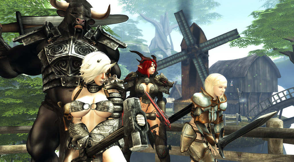
I have, by far, the lowest Draw Weight in this screenshot.
 At the time of this writing, my draw weight is 68,445, down from about 210,000 in January. I've managed to do this without anyone being able to see much if any difference in my appearance. I've cut out every hidden prim, every invisible root prim, every unseen texture, every redundant texture, every too-large texture and by replacing sculpts with mesh where possible. I'm sure if I replaced my remaining sculpts with mesh then I could cut my draw weight in half.

 My goal is to eventually reduce my draw weight out of the red (I think it turns to orange around 35,000), at which point I'll see if I can squeeze down to green.

 With mesh, if content creators start taking efficiency seriously, we can reach a point where there is no reason for anyone's draw weight to be over 35,000 and we can do that without sacrificing the quality of our avatars.


Saturday, February 23, 2013

More Vitruvian Shapes!

1.2 of the free Vitruvian Shapes set is now out and I've added two new shapes.

5'6"/171cm African Woman's shape.

4'11"/150cm Japanese Woman's shape.

This brings the total up to 12 shapes, 6 male and 6 female. I've also added a screenshot showing several full avatars using these shapes, compared to two of the Linden Starters.

The tallest Vitrvian avatar here is my remake of the SL "Action Male" starter at 6'3"/192cm. The original Linden "Action Male" on the left is 7'1". The fantasy style dwarf on the right is 5' even.

Just to reiterate, the Japanese woman shape, which is the second from the right, is 4'11"/150cm. She is 7 and 1/4 heads tall with wholly adult proportions. I kept with realistic, if idealized, proportions here, but I could reduce her head size and increase her leg length if I wanted to give her a 6' tall person's proportions while keeping her at a Japanese woman's height of 5-5'5" tall. I could probably cut several more inches while maintaining adult proportions before I ran into issues.

Just to entirely put to rest this common notion that you can't make good looking adult avatars shorter than 6' tall.

 A lot more is possible with the avatar than people realize, it seems so limited mostly due to the poor/broken interface. It's actually easier to accomplish attractive/realistic proportions in the 5-6' range than at the oversized heights people tend to use, because the limitations of the shape sliders are skewed against the sizes LL themselves encourage people to use.

 The difficult part is getting down to the smaller sizes in the first place. When you start with a 7' tall shape you need to adjust EVERYTHING, essentially creating a new shape from scratch, just to get down to the 5' range. And Linden Lab insists on forcing everyone to start with a 7' shape.

 Once you have a well proportioned 5' shape to start with, it's much easier to customize it within that range. This is why the appearance editor should provide multiple body types, all in different height ranges, for users to start with. That tiny, easily implemented change would make creating a custom shape much easier for users of all skill levels.


Thursday, February 21, 2013

Mesh Content Creators, You're Doing It Wrong!

Mesh is filling SL, which is great! I've recently redone Milk & Cream using as much mesh as possible and already people are telling me how great their framerates are despite the detail and sheer amount of content around the island!

I get an average of 30FPS around the new island with these graphics settings.
Shadows, Ambient occlusion, depth of field, etcetera.

I got 5-16FPS around the old island, which was mostly sculpts.
However, in building this I noticed one common thread in mesh content being sold in SL. Mesh content creators are building at the same sizes as they did with sculpts and prims prior to the introduction of mesh import and using that size as the basis for their advertised Land Impact costs. (When they're not outright lying to their customers by stating the number of mesh objects rather than the prim/LI cost, but that's another rant.)

 "Well, of course they would! Avatars are still 8' tall on average, and the SL default camera is still stuck in the 90's! They have to work around that!"

 Sure, to a point. You have to remember, mesh content gains Land Impact cost the larger you make it. I've literally cut the LI cost of mesh buildings in half by shrinking them down to a realistic size as opposed to the size the creator sold them at.

I was able to cut the LI cost of most of the mesh content down anywhere from 1/3 to 1/2!
This means more content around the island, which is still occupying only 1/4th of a sim!

 Lower Land  Impact costs are a boon to content creators because customers are often looking for the most bang for their buck in terms of detail versus LI cost. Higher LI means people can't fit as much in their land, and land is expensive!

 Before people point out many SL users can't even resize a prim I'm going to agree and counter that it is simplicity itself for a content creator to include both an "efficiently sized" version, the LI cost of which is what they advertise, and a scaled up version for more typical SL users. This takes, literally, seconds to do and costs the creator nothing.

 I'd add that content creators should make it clear in their listings that all LI costs are of the efficiently scaled version, and that a larger version is included with a higher LI cost. Most mesh sellers already note how SL changes LI costs based on size so this is a minor addition to what they're doing already.

 Ideally, Linden Lab themselves should be pushing more efficiently made content by improving the starter avatars, default camera settings and Linden maintained environments such as the infohubs, but since LL seems intent on driving customers away it would benefit content creators to encourage the trend towards efficient scale because it allows them to do so much more, and allows for an SL that is more appealing to new users, who in turn become new customers of the content creators.

Don't you wish all of SL was this detailed? It could be!
 In providing both the efficiently scaled version and the large version of their mesh content (as well as an explanation of why they are doing this and instructions on how to improve the SL camera), content creators ensure that their customers have the choice to use what better suits their needs, and and customers get exposed to how they can get more for their tier just by scaling down.

"I want less land and fewer prims, for the same amount of money!"
 - Nobody, Ever

Most people are simply unaware of the issue. It's in every content creator's best interest to make them aware of how size does matter in affecting their SL experience.

Friday, January 25, 2013

The Tallest Avatar Shape

I've often cited 8'10"/270cm as the tallest SL avatars can be.

That is the male mesh wearing a shoe clothing layer for the additional height that provides.

However, I was recently taking a closer look at that in an attempt to create an as proportionate as possible giant avatar. Using more accurate prim measurements, rather than the scripted rulers I usually use for cursory looks, I found the maximum height of the SL avatar is actually 8'8"/263cm.

Without the shoe layer height, the male avatar mesh maxes out at 8'3"/251cm.

As for how successful I was in creating a proportionate giant?

Avatars this size are more common than male avatars shorter than the yellow NBA figure in the middle.
The male avatar is far better for this than the female, as, without the shoe layer height, he can at least have his arms proportionately long when maxed out. Unfortunately this means you cannot make the arms longer than would be proportionate for an adult human of normal stature, most giants are depicted as either being gangly or having emphasized upper bodies, both of which require longer than average arms to achieve.

The avatar also had a short torso, even maxed out at 100 the torso was nearly half a foot too short for his body. This wouldn't have been so bad if the arms could be equally long respective to the legs to achieve that lanky, gangly look, like the giants of Skyrim.

Another odd thing, but maxing out the head size does allow for the giant to be almost exactly 8 heads tall, so there's really no excuse for all the pin-headed avatars.

 Still, it's not something I'd feel comfortable slapping the "Vitruvian Shapes" moniker on and it really highlights the limitations of the appearance editor that while you can make a shape over eight and a half feet tall, you can't give it the proportions of a figure that tall.

Saturday, April 14, 2012

Beautiful Second Life part 2

Beautiful Second Life
Why Linden Lab needs to present a more impressive
image of Second Life and how they can achieve that.

Part 2


 Ok, so we've shown how LL can encourage better looking avatars in SL, what else could be improved to make SL more visually appealing and nurture better looking content from the userbase?

 LL needs to start providing better looking public areas.

That means the tutorial/orientation sims, the welcome areas/infohubs and any other "Public Works" projects.

 How do I mean? Well, most people taking a look at SL are probably familiar with virtual worlds already. Videogames have been creating immersive, interactive virtual worlds to explore for several decades now, and when people look at Second Life's visual's they're going to be comparing it to the likes of these:

"Borderlands" for the Xbox 360

"Dead Space 2" for the PS3
"Twilight Princess" for the Nintendo Wii
"Shadow of the Colossus" for the PS2
"World of Warcraft" for the PC
These are the expectations set by about ten years of videogames. In contrast, this is the face Linden Lab puts forward for Second Life:

This was the Second Life website's mainpage image for a while. You can bet this is Photoshopped to look better than a straight screenshot, too.
Another one taken straight from the official Second Life website. The hut is cute, but this showcases how users struggle balancing resources against detail and generally isn't a good shot to use in promoting Second Life.
The Wilderness, a new area designed to test the new pathfinding features LL is adding soon is a huge step up from the average Linden developed content, but it's still not blowing the socks off of anyone.

What you can't see here are the alpha sorting issues resulting in an obnoxious flickering wherever one plant overlaps another, which is to say everywhere, because SL does not allow users to upload 1-bit alpha textures.

 But let's look at how good Second Life can look.

The Cyberpunk City of INSILICO
The sci-fi horror sim, "Doomed Ship"
(I always find I have my highest SL framerates in this sim.)
The floating island of "Milk & Cream"
 Would you believe that none of these three SL screenshots were taken with higher end features like shadows enabled? Also, all three predate the addition of mesh. My point being that it does not take a powerful computer to make SL look good if a sim is well made and employs good windlight presets.


 So what is the deal? If SL is capable of looking as good or better than many popular, professionally produced videogames, why do the Linden sims and marketing screenshots all look so bad?

 Well, a large part of it is just that LL does not hire professional artists to create their in-house content. They hire resident creators called "Moles", who are often amateur hobbyists who just happen to like building in SL. LL then provides them no real direction or support, as there is no in-house art team.

 As a result, the environments created for Linden Lab suffer from a lot of recurring problems. Like a lack of proper scale, poor lighting, inefficient use of resources and no real sense of design.

 Because of these issues Linden owned sims are often low on detail and content, spread out over much to large an area (making it a chore to wander between points of interest while exploring) and generally don't lead visitors through them like a proper environment (real or virtual) should.

Worse yet, the SL userbase as a whole is less likely to be exposed to quality builds which showcase Second Life's true potential. Such environmental pieces provided to the userbase via the Library, which new users often make use of to see how things are made, provide poor examples and instill bad building habits.

 The obvious solution here is to hire better artists to build better environments, but it's not entirely that simple.

 You have to realize that there are flaws with both the default SL visual settings, and the content creation tools themselves which make it extra difficult to create good looking environments in SL.

 First, there is the whole issue of scale. I've written an entire article on that problem alone, so I won't repeat it all here. To summarize, almost all content in Second Life is built to double scale or larger.This spreads content out over a larger area (making sims more tedious to explore, those interesting buildings in the distance are twice as far away if the sim is built double scale) and puts a greater strain on resources while making it more difficult to create detailed, content heavy environments. In addition to making it more difficult to create better looking builds, this problem of scale also limits us creatively, by giving us a smaller land area to work with, respective to the size of our creations.

 And why is everything in SL, from avatars to buildings, so oversized?


1. LL starts new users off with 7' tall avatars and provides incorrect height in the appearance editor.

 This is solved easily enough by reducing the size of the starter avatars and correcting the bug displaying incorrect height in the appearance editor. Doing these things and given enough time, the trend will eventually be towards smaller avatars.

Can't see! Ceiling too low for the SL camera!


2. The SL camera placement is set unreasonably high above the avatar. forcing ceilings to be higher, forcing people to build larger in general.

 This can be fixed simply by changing some numbers in the default camera placement presets. Instructions for doing so are HERE.

 Correcting these two issues and building Linden owned sims to more sensible scale would not only help Linden Lab create more impressive and engaging locations to draw new users into SL, but would free the userbase to take better advantage of scale in their own builds.

 To be clear, tho, building to scale does not always mean building small. Linden owned builds should, primarily, be accessible by avatars of all sizes. However, that means building larger structures while maintaining correct scale. Windows smaller avatars can see out of, tables, countertops and chairs scaled to realistically sized human avatars with doors and ceiling heights accessible for dragons and werewolves.

 As many of Linden Lab's builds are large, open affairs, this shouldn't be a problem. The idea isn't to restrict access to avatars of larger sizes, but to demonstrate scale.

 Second, there is the issue of efficient use of resources. Linden builds often have a much higher land impact than they should need for the amount of detail present. Linden builds should demonstrate effective use of the tools available, including sculpts and mesh. This would allow them to showcase more detailed environments, while providing examples of how to create more detail in SL to the residents who examine these builds while learning how to create their own content.

Currently there are no tools in the viewer allowing the creation of either sculpts or mesh, despite the fact that user created in-world tools have shown how easy it would be to create a client-side sculpt creation tool that users familiar with prim building would find easy to use. Linden Lab should investigate the possibilities here.

 In addition to good use of sculpts and mesh, Linden builds should demonstrate effective use of SL's native prim building system, demonstrating how more detail can be pulled from using cut, hollow and other prim features.

 Providing full perm versions of well-made structures used in Linden owned builds via the Library could be a very good learning tool for new residents. Providing poorly made content this way hurts the ability of beginning builders to learn good building techniques.

 Finally, there is the issue of poor windlight defaults. "Windlight" is Second Life's sky and atmospheric shader system. Proper windlight settings can make all the difference between an environment in Second Life looking awful or gorgeous, yet LL insists on using exceptionally poor settings for the defaults.

Here is a scene using the default sky settings:


And that very same scene with custom windlight settings;


 Better windlight defaults would come at no performance cost to users, yet they have such a profound impact on visual the visual quality of Second Life. Few users see anything other than the defaults, except possibly when they enter a sim with it's own estate windlight settings. Others find the default settings so bad they stick to a single daytime preset and so never see the world as those around them do.


 Beyond the problems, there's a few things Linden Lab really needs to keep in mind with their future building projects.

 Lighting is often overlooked or poorly done in Linden owned builds. When creating public environments, Linden Lab should look for people capable of making good use of lighting, including high end features like projected lights. A good environment designer can balance the two so that whether or not a visitor has shadows enabled, the lighting should be suitable.

Linden builds are often guilty of using default settings on light sources when they use lights at all. A plain, white light with the only change being to increase the radius. These lights look horribly unnatural and tend to wash out nearby textures.

What's wrong with this picture?
This screenshot demonstrates a Linden infohub where the visible lights (the lanterns) do not cast any light in-world, but the potted tree does!  The effect, of course, is off-putting. Darkness around all of the visible light sources, light being cast around the trees where no visible source is to be seen. Worse yet, every single potted tree in the infohub was a light source and there were 12 such trees on this terrace alone. This means constantly flickering lights for everyone without shadows enabled.

 Lighting is so important to environment design that movie and game studios both tend to hire professionals that focus entirely on that.

 Sound is another issue Linden Lab needs to be conscious of. Although it doesn't show up in screenshots, use of sound is vital in environment design, yet most Linden builds are entirely silent. Even in their "Wilderness" sim, an SL showcase currently being promoted to SL users with Premium accounts, very little use of sound. There's even a huge, multi-story waterfall that is entirely silent.

 Like windlight, the camera FOV settings can be used to make SL look better without impacting user performance and framerates. I've found upping my FOV by a few levels (pressing ctrl+0 about 5 times) adds a much more cinematic sense of depth to SL's visuals, a trick used by a lot of modern videogames.


 In closing, Second Life can be gorgeous, but few people, whether they're active Second Life users or people who've yet to try the virtual world, will ever know this unless Linden Lab makes a point of showing them.

 Well made starter avatars, well made public environments like the Welcome Areas and Infohubs, and visually impressive windlight defaults can all be employed to showcase the potential in SL's graphics capabilities.

Wednesday, April 11, 2012

Beautiful Second Life

Beautiful Second Life
Why Linden Lab needs to present a more impressive
image of Second Life and how they can achieve that.

Part 1


 There are three major complaints we often hear from those who have tried Second Life and given up on it. Three problems that are cited again and again as reasons why so many potential new users have left, never to return.

 "It's ugly."

 "It's confusing."

 "There's nothing to do."

 Volumes could be written about all three of these problems, but right now I'm just going to focus on the first. "It's ugly."

An SL promotional image straight from the official website. Note the simple geometry of the environment, the apparent absence of shaders, the girl with hair that doesn't appear to fit her head, and the 8' tall man whose proportions indicate he was put through Willy Wonka's taffy stretching machine.

 It really must be said that Second Life is ugly. This is not in question. There is no debate to be had here. Second Life is ugly. Anyone who says otherwise is either in denial or has no frame of reference.

Choose your appearance from misshapen mutant humanoids, mismatched parts from furry avatars slapped on hastily made shapes, or some nifty looking robots and vehicles! Do you feel pretty yet?

 Oh, sure, there is content within Second Life that can, under the right circumstances, be gorgeous. Believe me, I'm well aware of how good SL can look. It's just that arguing this in the face of how ugly SL is to the average new or ex-user misses the point entirely.

 Most SL users, even those that stick around for years, will never see anything in SL that is anywhere close to how good SL is capable of looking. This isn't because their computer isn't up to rendering all the pretty effects, either.

 You also need to get it out of your head that it takes a monster of a computer to make SL look good. That is simply not the case. While you won't get all of the shiny features that really make SL gorgeous, you can still make SL look great on 10 year old computers, or a machine you would put together today for under $500.

No, this is all about design and Second Life's default settings and starter content. That's where the biggest problems are.

 How do I mean? Well, let's start with a new user's very first impression of SL. The starter avatars.


 Currently, new users are offered a pretty wide selection of avatars to choose from when they start. I'd go so far as to say too many. Still, the human starters all share a lot of the same common flaws, and as most people signing up are likely to choose a human avatar they're a good place to start.

 Long time SL users will often comment about how the starter avatars in recent years are a huge improvement over the early starter avatars foisted on SL from the beginning up until about 2010 or so. However, "better than what they used to have" isn't exactly a stellar recommendation, and new users aren't likely to have their impressions of the current starters influenced by how bad the starter avatars were in 2005.

 If you're the average person, you'll probably look at these and find none of them particularly interesting. You might comment on SL's poor graphics and chalk up the less than appealing selection to that. If you've had any art training, on the other hand, you're probably shaking your head and wondering how avatars with such poor proportions could have possibly gotten past Linden Lab's art director and been selected to provide new users with their very first impression of Second Life.

 All of these avatars have tiny heads, absurdly long legs, and the women in particular have freakishly short arms. Why the women? Because the appearance editor was set up by someone completely unfamiliar with human anatomy. The arm length slider for women (but not for men) is skewed in such a way that you need to set your arm length around 80-100 (maxed out) to have just proportionately long arms, and if your avatar is much taller than 6'/183cm then it actually becomes impossible to have proportionate arms.

 The shortest female starter avatar from the selection pictured is about 6'8"/203cm. All of the human starter avatars are similarly oversized, which creates other problems we'll get to later.

 That's not the half of it. Once you actually log in, these avatars look even worse!

 Since all avatars start with the same default animations, that girl in the red coat carrying the giant purse? That giant purse is constantly clipping through her legs and torso Not just a little, she shoves it right through her body, impaling herself completely like some sort of surrealist social commentary.

 Also, invisiprims, a graphical glitch that used to be the only way of masking the avatar mesh to allow for things like shoes were disabled by LL over half a year ago now for anyone enabling shadows, meaning no matter which starter avatar you choose, if you want shadows on in SL you are now treated to this sight!

Lovely, isn't it?

That's right, Linden Lab is so concerned about making a good impression, most of the human starter avatars still rely on a glitch LL disabled over half a year ago now. Worse yet, since invisiprims still work for anyone who doesn't have shadows enabled, you will still see many avatars walking around broken, on your screen at least, because of this.

 So how can Linden Lab make avatars look good?

 Easy.


 In an ideal world, Linden Lab would go so far as to create a brand new, better made avatar mesh and an all-new appearance editor to go with it, but for the purpose of this article we are only looking at how Linden Lab could easily improve the visual experience of SL with a minimal investment in time and resources.


 First, LL needs to recognize that they need to address both the starter avatars and the avatar creation tools.

As far as the starter avatars go, the smartest route would be to provide a small number of impressive looking starter avatars to choose from. Don't try to sabotage the appearance of the starter avatars in the hopes that a desire for better quality will drive people towards user created avatars and accessories, instead let the desire for a unique appearance drive that desire.

 Believe it or not, SL avatars can look pretty good. Here's some examples.
Not too shabby, eh?
So if SL avatars can look like that, why do so many look like this?

Sexy!

 Well, aside from the bad starter avatars LL foists on new users, there's also the issue of the appearance editor. Quite frankly, it's broken. I go over how in detail in "A Matter of Proportion" but I'll recap briefly here and see if we can point out more solutions to the problems.

 1. When creating a new shape you are offered only two options, male or female, to start from. Both of these shapes have abysmal proportions (head too small, arms too short, legs too long, etcetera).

 LL could vastly improve on this by providing multiple base shapes for people to choose from. The very first option you should have when creating a brand new shape is "what body type do you want?" Do you want a muscular super hero? A tall, thin super model? Do you want to create an overweight shape? Maybe you'd rather a more average body shape to start with? Each of these options should be properly scaled and proportioned to start with, letting you customize from there, rather than starting you with a 7' tall mutant with short arms and stork-like legs.

 2. The height shown in the appearance editor is wrong. That's right, if you're using the official Second Life viewer, the height displayed in the appearance editor is off by about six inches, telling you that you're shorter than you actually are. If it says 6' even, you're actually about 6'6" or 6'7" or so. This encourages larger avatars, which creates more problems than you might initially realize. The most immediate being that the arm length slider for women maxes out with short arms  if you go over about 6' tall.

 LL could fix this by simply making the appearance editor show your correct height. Several popular TPVs accomplished this years ago, before LL opted to display avatar height in the appearance editor at all. That's right, LL added the feature broken, and worse they knew it was broken when they added it.

3. The proportion sliders are skewed in awkward ways. All of the sliders go from 0 to 100. You might assume that moving all of the sliders to 50 will give you an average sized human of average proportions. You'd be wrong. Instead, you'd get an overweight half troll, half Vulcan suffering from thalidomide poisoning.

Too sexy for this blog!
 Worse yet, you run into issues like the fact that female avatars often find they cannot make their arms long enough to be proportional! You need to practically max out arm length to get proper arm proportions. Even that only works if your avatar is 6' or shorter, which is bad because LL starts women out at 6'4" and the tendency is towards larger avatars due to an irrational stigma against shorter avatars, which some claim are "childlike". Yes, you read that right, avatars shorter than 6'4" are considered childlike. Even if they're obvious non-humans like dwarves, goblins and aliens.

Sad part is, the guy enforcing the rule was going by the broken height mentioned earlier. So the real rule was  a 5'3" (taller than the average adult woman's height in most of the world)  minimum. And if you pointed that out they'd probably just ban you.
4. There are no guides to help you create a shape with correct human proportions. In addition to it being difficult, or in some cases impossible, to create a well proportioned shape from the horrible starting shapes, there are no tools or guides to make it any easier. The only way to even check your proportions is by rezzing prims while sitting on a pose stand.


 LL could make it a lot easier to create better looking avatars if they added a set of visible proportion guides, like a silhouette, behind the avatar while editing your shape. Another very helpful tool would be a "proportion lock", which automatically kept your avatar in proportion. An optional lock that could be toggled on or off so no freedom to create deliberately non-human or stylized shapes would be lost.

5. There is no slider to scale an entire avatar larger or smaller while keeping their shape in proportion. That's right. If you adjust the "height" slider, you arms, legs and other body parts do not resize with your overall height. You'll quickly find your proportions entirely messed up if you alter height more than a few inches. This is made extra confusing by the fact that "Height" is not the only slider that affects avatar size. There are 8 sliders in all that affect your avatar's height.

Re-sizing a shape could be greatly simplified if there were a single "scale" slider that adjusted your whole shape, proportionately, as you re-sized yourself.

That about covers the avatar situation. To recap:
 1. Provide a small selection of great looking, properly scaled and proportioned avatars that impress new users and give them a strong base to start from when they go to customize their appearance.

 2. Provide a range of pre-made, properly scaled and proportioned body types for people to choose from when creating a new shape. (Bury the old shapes in the depths of the Library.)

3. Fix the problems with the appearance editor that make it more difficult to create good shapes.   Fix the way proportion sliders are skewed between male and female shapes.
   Fix the torso muscle bug that breaks increasing torso muscles beyond 50 on the female shape.
   Show correct height.
   Provide proportion guides and a "proportion lock" that can be toggled on/off.
   Provide a single slider that scales an entire avatar larger or smaller while keeping their body in proportion.

 If Linden Lab can manage all of that, then "ugly avatars" will no longer be an obstacle to drawing in new users, or retaining those they attract already.


 To be continued in part 2 where we will look at how LL can create better environments for public sims while also nurturing better looking community created environments.

Friday, April 6, 2012

Vitruvian Shapes Now FREE!

 That's right, I've made all of my Vitruvian shapes completely free, making it that much easier for everyone in SL to have a great looking, properly proportioned shape.

 I'm also working on some new additions to the line, which I hope to have ready soon. These will also be free upon release.

 You can find these shapes on the SL Marketplace, or one of my inworld shop locations.

 Since a lot of people seem to be having trouble with the new "Direct Delivery" setup on the Marketplace I didn't want to mess with the actual items, so the shapes on the marketplace are still no-transfer. The ones in-world are full perm. I'll make the marketplace shapes full-perm just as soon as it seems like doing so will be relatively headache-free.

 I've attempted, twice now, to donate the shapes to LL. Still waiting on them to get back to me.

Thursday, January 12, 2012

Improving the SL Camera (Short Version)

I've updated this post! Check out the polished up version of this article!

 Last year I wrote a lengthy article explaining why camera placement matters in virtual environments, how the SL camera works and, finally, how to improve the SL camera yourself by adjusting some debug settings. By popular demand, here is an excerpt with just the part about how to improve your SL camera!


The Improved SL Camera

 If you like these camera settings, contact LL or the creators of your favourite SL viewer and ask them to include them as selectable presets! That way you don't have to manually enter them in with every viewer update and you can more easily share them to your friends!


 I am including in these directions the changes one needs to make to get either a centred view or a left shoulder offset. Most people prefer the right shoulder offset however some people who do not play many videogames have found the offset view difficult to adjust to and I've had at least one person ask me how to get a left shoulder view.

First you need to reveal the Advanced menu at the top of your screen. To do this simply press ctrl+alt+d and the menu will appear to the right of the Help menu in your menu bar. Viewer 3 users can also go to the Advanced tab in Preferences and select to have the Advanced menu shown.


 From the Advanced menu select "Show Debug Settings", near the bottom.


 The Debug Settings panel will appear. At the top of the Debug Settings panel is a field where you can type the name of the setting you'd like to adjust. 

 Viewer 3 users will want to type "CameraOffsetRearView".

 People using a 1.x viewer will instead type "CameraOffsetDefault".


The panel provides you with three integers to change for the x, y and z placement of your CameraOffset.  Change them to these settings;

x: -2.000
y: -0.400   ( Make positive for a left shoulder offset, leave as 0.000 for a centred view. ) 
z: -0.200

 Once that is done click on the input field again and move to the next setting;

Viewer 3 users will type "FocusOffsetRearView".

People using 1.x viewers will type "FocusOffsetDefault".


Once more you will have x, y and z  positions, this time for the focus point.
 Change them to these settings;

x: 0.900
y: -0.700   ( Make positive for a left shoulder offset, leave as 0.000 for a centred view. ) 
z: 0.200
Viewer 3 users will see their camera change as they enter each number, 1.x users may need to restart SL to see the changes to their camera take effect. 

Here's some solutions to issues some people run into.

Avatar fills entire screen. Simply zoom the camera out! The mousewheel zoom controls work exactly like before. You can also adjust the "x" CameraOffset to move the default camera position forward or back.

The view is odd, I can't see where I'm going/camera points up!
 Make sure you change both the CameraOffset and the FocusOffset. If you only change one and not the other it wont' do you much good at all!

 If you did everything correctly your view in SL should resemble this;


And this;


Click and hold on your avatar to angle your view up or down, even as you move!
 Enjoy!


 05-07-2012 Update! FOV improvement!
 Something I've noticed is that you can improve your SL view further by altering the FOV.


First, press ctrl+9 to make sure your FOV is at the default. Then, hold the ctrl key down and press 0 about 6 times. The resulting effect is that SL seems to have a greater sense of depth.

 It's difficult to capture this effect in screenshots as it has more to do with the way things look as your camera moves about, but I've found this to be a huge improvement in making SL look more cinematic.