Saturday, April 14, 2012

Beautiful Second Life part 2

Beautiful Second Life
Why Linden Lab needs to present a more impressive
image of Second Life and how they can achieve that.

Part 2


 Ok, so we've shown how LL can encourage better looking avatars in SL, what else could be improved to make SL more visually appealing and nurture better looking content from the userbase?

 LL needs to start providing better looking public areas.

That means the tutorial/orientation sims, the welcome areas/infohubs and any other "Public Works" projects.

 How do I mean? Well, most people taking a look at SL are probably familiar with virtual worlds already. Videogames have been creating immersive, interactive virtual worlds to explore for several decades now, and when people look at Second Life's visual's they're going to be comparing it to the likes of these:

"Borderlands" for the Xbox 360

"Dead Space 2" for the PS3
"Twilight Princess" for the Nintendo Wii
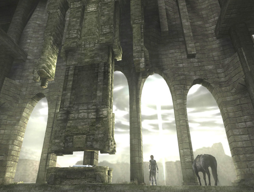
"Shadow of the Colossus" for the PS2
"World of Warcraft" for the PC
These are the expectations set by about ten years of videogames. In contrast, this is the face Linden Lab puts forward for Second Life:

This was the Second Life website's mainpage image for a while. You can bet this is Photoshopped to look better than a straight screenshot, too.
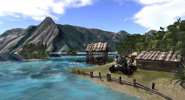
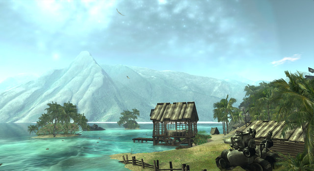
Another one taken straight from the official Second Life website. The hut is cute, but this showcases how users struggle balancing resources against detail and generally isn't a good shot to use in promoting Second Life.
The Wilderness, a new area designed to test the new pathfinding features LL is adding soon is a huge step up from the average Linden developed content, but it's still not blowing the socks off of anyone.

What you can't see here are the alpha sorting issues resulting in an obnoxious flickering wherever one plant overlaps another, which is to say everywhere, because SL does not allow users to upload 1-bit alpha textures.

 But let's look at how good Second Life can look.

The Cyberpunk City of INSILICO
The sci-fi horror sim, "Doomed Ship"
(I always find I have my highest SL framerates in this sim.)
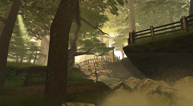
The floating island of "Milk & Cream"
 Would you believe that none of these three SL screenshots were taken with higher end features like shadows enabled? Also, all three predate the addition of mesh. My point being that it does not take a powerful computer to make SL look good if a sim is well made and employs good windlight presets.


 So what is the deal? If SL is capable of looking as good or better than many popular, professionally produced videogames, why do the Linden sims and marketing screenshots all look so bad?

 Well, a large part of it is just that LL does not hire professional artists to create their in-house content. They hire resident creators called "Moles", who are often amateur hobbyists who just happen to like building in SL. LL then provides them no real direction or support, as there is no in-house art team.

 As a result, the environments created for Linden Lab suffer from a lot of recurring problems. Like a lack of proper scale, poor lighting, inefficient use of resources and no real sense of design.

 Because of these issues Linden owned sims are often low on detail and content, spread out over much to large an area (making it a chore to wander between points of interest while exploring) and generally don't lead visitors through them like a proper environment (real or virtual) should.

Worse yet, the SL userbase as a whole is less likely to be exposed to quality builds which showcase Second Life's true potential. Such environmental pieces provided to the userbase via the Library, which new users often make use of to see how things are made, provide poor examples and instill bad building habits.

 The obvious solution here is to hire better artists to build better environments, but it's not entirely that simple.

 You have to realize that there are flaws with both the default SL visual settings, and the content creation tools themselves which make it extra difficult to create good looking environments in SL.

 First, there is the whole issue of scaleI've written an entire article on that problem alone, so I won't repeat it all here. To summarize, almost all content in Second Life is built to double scale or larger.This spreads content out over a larger area (making sims more tedious to explore, those interesting buildings in the distance are twice as far away if the sim is built double scale) and puts a greater strain on resources while making it more difficult to create detailed, content heavy environments. In addition to making it more difficult to create better looking builds, this problem of scale also limits us creatively, by giving us a smaller land area to work with, respective to the size of our creations.

 And why is everything in SL, from avatars to buildings, so oversized?


1. LL starts new users off with 7' tall avatars and provides incorrect height in the appearance editor.

 This is solved easily enough by reducing the size of the starter avatars and correcting the bug displaying incorrect height in the appearance editor. Doing these things and given enough time, the trend will eventually be towards smaller avatars.

Can't see! Ceiling too low for the SL camera!


2. The SL camera placement is set unreasonably high above the avatar. forcing ceilings to be higher, forcing people to build larger in general.

 This can be fixed simply by changing some numbers in the default camera placement presets. Instructions for doing so are HERE.

 Correcting these two issues and building Linden owned sims to more sensible scale would not only help Linden Lab create more impressive and engaging locations to draw new users into SL, but would free the userbase to take better advantage of scale in their own builds.

 To be clear, tho, building to scale does not always mean building small. Linden owned builds should, primarily, be accessible by avatars of all sizes. However, that means building larger structures while maintaining correct scale. Windows smaller avatars can see out of, tables, countertops and chairs scaled to realistically sized human avatars with doors and ceiling heights accessible for dragons and werewolves.

 As many of Linden Lab's builds are large, open affairs, this shouldn't be a problem. The idea isn't to restrict access to avatars of larger sizes, but to demonstrate scale.

 Second, there is the issue of efficient use of resources. Linden builds often have a much higher land impact than they should need for the amount of detail present. Linden builds should demonstrate effective use of the tools available, including sculpts and mesh. This would allow them to showcase more detailed environments, while providing examples of how to create more detail in SL to the residents who examine these builds while learning how to create their own content.

Currently there are no tools in the viewer allowing the creation of either sculpts or mesh, despite the fact that user created in-world tools have shown how easy it would be to create a client-side sculpt creation tool that users familiar with prim building would find easy to use. Linden Lab should investigate the possibilities here.

 In addition to good use of sculpts and mesh, Linden builds should demonstrate effective use of SL's native prim building system, demonstrating how more detail can be pulled from using cut, hollow and other prim features.

 Providing full perm versions of well-made structures used in Linden owned builds via the Library could be a very good learning tool for new residents. Providing poorly made content this way hurts the ability of beginning builders to learn good building techniques.

 Finally, there is the issue of poor windlight defaults. "Windlight" is Second Life's sky and atmospheric shader system. Proper windlight settings can make all the difference between an environment in Second Life looking awful or gorgeous, yet LL insists on using exceptionally poor settings for the defaults.

Here is a scene using the default sky settings:


And that very same scene with custom windlight settings;


 Better windlight defaults would come at no performance cost to users, yet they have such a profound impact on visual the visual quality of Second Life. Few users see anything other than the defaults, except possibly when they enter a sim with it's own estate windlight settings. Others find the default settings so bad they stick to a single daytime preset and so never see the world as those around them do.


 Beyond the problems, there's a few things Linden Lab really needs to keep in mind with their future building projects.

 Lighting is often overlooked or poorly done in Linden owned builds. When creating public environments, Linden Lab should look for people capable of making good use of lighting, including high end features like projected lights. A good environment designer can balance the two so that whether or not a visitor has shadows enabled, the lighting should be suitable.

Linden builds are often guilty of using default settings on light sources when they use lights at all. A plain, white light with the only change being to increase the radius. These lights look horribly unnatural and tend to wash out nearby textures.

What's wrong with this picture?
This screenshot demonstrates a Linden infohub where the visible lights (the lanterns) do not cast any light in-world, but the potted tree does!  The effect, of course, is off-putting. Darkness around all of the visible light sources, light being cast around the trees where no visible source is to be seen. Worse yet, every single potted tree in the infohub was a light source and there were 12 such trees on this terrace alone. This means constantly flickering lights for everyone without shadows enabled.

 Lighting is so important to environment design that movie and game studios both tend to hire professionals that focus entirely on that.

 Sound is another issue Linden Lab needs to be conscious of. Although it doesn't show up in screenshots, use of sound is vital in environment design, yet most Linden builds are entirely silent. Even in their "Wilderness" sim, an SL showcase currently being promoted to SL users with Premium accounts, very little use of sound. There's even a huge, multi-story waterfall that is entirely silent.

 Like windlight, the camera FOV settings can be used to make SL look better without impacting user performance and framerates. I've found upping my FOV by a few levels (pressing ctrl+0 about 5 times) adds a much more cinematic sense of depth to SL's visuals, a trick used by a lot of modern videogames.


 In closing, Second Life can be gorgeous, but few people, whether they're active Second Life users or people who've yet to try the virtual world, will ever know this unless Linden Lab makes a point of showing them.

 Well made starter avatars, well made public environments like the Welcome Areas and Infohubs, and visually impressive windlight defaults can all be employed to showcase the potential in SL's graphics capabilities.

Wednesday, April 11, 2012

Beautiful Second Life

Beautiful Second Life
Why Linden Lab needs to present a more impressive
image of Second Life and how they can achieve that.

Part 1


 There are three major complaints we often hear from those who have tried Second Life and given up on it. Three problems that are cited again and again as reasons why so many potential new users have left, never to return.

 "It's ugly."

 "It's confusing."

 "There's nothing to do."

 Volumes could be written about all three of these problems, but right now I'm just going to focus on the first. "It's ugly."

An SL promotional image straight from the official website. Note the simple geometry of the environment, the apparent absence of shaders, the girl with hair that doesn't appear to fit her head, and the 8' tall man whose proportions indicate he was put through Willy Wonka's taffy stretching machine.

 It really must be said that Second Life is ugly. This is not in question. There is no debate to be had here. Second Life is ugly. Anyone who says otherwise is either in denial or has no frame of reference.

Choose your appearance from misshapen mutant humanoids, mismatched parts from furry avatars slapped on hastily made shapes, or some nifty looking robots and vehicles! Do you feel pretty yet?

 Oh, sure, there is content within Second Life that can, under the right circumstances, be gorgeous. Believe me, I'm well aware of how good SL can look. It's just that arguing this in the face of how ugly SL is to the average new or ex-user misses the point entirely.

 Most SL users, even those that stick around for years, will never see anything in SL that is anywhere close to how good SL is capable of looking. This isn't because their computer isn't up to rendering all the pretty effects, either.

 You also need to get it out of your head that it takes a monster of a computer to make SL look good. That is simply not the case. While you won't get all of the shiny features that really make SL gorgeous, you can still make SL look great on 10 year old computers, or a machine you would put together today for under $500.

No, this is all about design and Second Life's default settings and starter content. That's where the biggest problems are.

 How do I mean? Well, let's start with a new user's very first impression of SL. The starter avatars.


 Currently, new users are offered a pretty wide selection of avatars to choose from when they start. I'd go so far as to say too many. Still, the human starters all share a lot of the same common flaws, and as most people signing up are likely to choose a human avatar they're a good place to start.

 Long time SL users will often comment about how the starter avatars in recent years are a huge improvement over the early starter avatars foisted on SL from the beginning up until about 2010 or so. However, "better than what they used to have" isn't exactly a stellar recommendation, and new users aren't likely to have their impressions of the current starters influenced by how bad the starter avatars were in 2005.

 If you're the average person, you'll probably look at these and find none of them particularly interesting. You might comment on SL's poor graphics and chalk up the less than appealing selection to that. If you've had any art training, on the other hand, you're probably shaking your head and wondering how avatars with such poor proportions could have possibly gotten past Linden Lab's art director and been selected to provide new users with their very first impression of Second Life.

 All of these avatars have tiny heads, absurdly long legs, and the women in particular have freakishly short arms. Why the women? Because the appearance editor was set up by someone completely unfamiliar with human anatomy. The arm length slider for women (but not for men) is skewed in such a way that you need to set your arm length around 80-100 (maxed out) to have just proportionately long arms, and if your avatar is much taller than 6'/183cm then it actually becomes impossible to have proportionate arms.

 The shortest female starter avatar from the selection pictured is about 6'8"/203cm. All of the human starter avatars are similarly oversized, which creates other problems we'll get to later.

 That's not the half of it. Once you actually log in, these avatars look even worse!

 Since all avatars start with the same default animations, that girl in the red coat carrying the giant purse? That giant purse is constantly clipping through her legs and torso Not just a little, she shoves it right through her body, impaling herself completely like some sort of surrealist social commentary.

 Also, invisiprims, a graphical glitch that used to be the only way of masking the avatar mesh to allow for things like shoes were disabled by LL over half a year ago now for anyone enabling shadows, meaning no matter which starter avatar you choose, if you want shadows on in SL you are now treated to this sight!

Lovely, isn't it?

That's right, Linden Lab is so concerned about making a good impression, most of the human starter avatars still rely on a glitch LL disabled over half a year ago now. Worse yet, since invisiprims still work for anyone who doesn't have shadows enabled, you will still see many avatars walking around broken, on your screen at least, because of this.

 So how can Linden Lab make avatars look good?

 Easy.


 In an ideal world, Linden Lab would go so far as to create a brand new, better made avatar mesh and an all-new appearance editor to go with it, but for the purpose of this article we are only looking at how Linden Lab could easily improve the visual experience of SL with a minimal investment in time and resources.


 First, LL needs to recognize that they need to address both the starter avatars and the avatar creation tools.

As far as the starter avatars go, the smartest route would be to provide a small number of impressive looking starter avatars to choose from. Don't try to sabotage the appearance of the starter avatars in the hopes that a desire for better quality will drive people towards user created avatars and accessories, instead let the desire for a unique appearance drive that desire.

 Believe it or not, SL avatars can look pretty good. Here's some examples.
Not too shabby, eh?
So if SL avatars can look like that, why do so many look like this?

Sexy!

 Well, aside from the bad starter avatars LL foists on new users, there's also the issue of the appearance editor. Quite frankly, it's broken. I go over how in detail in "A Matter of Proportion" but I'll recap briefly here and see if we can point out more solutions to the problems.

 1. When creating a new shape you are offered only two options, male or female, to start from. Both of these shapes have abysmal proportions (head too small, arms too short, legs too long, etcetera).

 LL could vastly improve on this by providing multiple base shapes for people to choose from. The very first option you should have when creating a brand new shape is "what body type do you want?" Do you want a muscular super hero? A tall, thin super model? Do you want to create an overweight shape? Maybe you'd rather a more average body shape to start with? Each of these options should be properly scaled and proportioned to start with, letting you customize from there, rather than starting you with a 7' tall mutant with short arms and stork-like legs.

 2. The height shown in the appearance editor is wrong. That's right, if you're using the official Second Life viewer, the height displayed in the appearance editor is off by about six inches, telling you that you're shorter than you actually are. If it says 6' even, you're actually about 6'6" or 6'7" or so. This encourages larger avatars, which creates more problems than you might initially realize. The most immediate being that the arm length slider for women maxes out with short arms  if you go over about 6' tall.

 LL could fix this by simply making the appearance editor show your correct height. Several popular TPVs accomplished this years ago, before LL opted to display avatar height in the appearance editor at all. That's right, LL added the feature broken, and worse they knew it was broken when they added it.

3. The proportion sliders are skewed in awkward ways. All of the sliders go from 0 to 100. You might assume that moving all of the sliders to 50 will give you an average sized human of average proportions. You'd be wrong. Instead, you'd get an overweight half troll, half Vulcan suffering from thalidomide poisoning.

Too sexy for this blog!
 Worse yet, you run into issues like the fact that female avatars often find they cannot make their arms long enough to be proportional! You need to practically max out arm length to get proper arm proportions. Even that only works if your avatar is 6' or shorter, which is bad because LL starts women out at 6'4" and the tendency is towards larger avatars due to an irrational stigma against shorter avatars, which some claim are "childlike". Yes, you read that right, avatars shorter than 6'4" are considered childlike. Even if they're obvious non-humans like dwarves, goblins and aliens.

Sad part is, the guy enforcing the rule was going by the broken height mentioned earlier. So the real rule was  a 5'3" (taller than the average adult woman's height in most of the world)  minimum. And if you pointed that out they'd probably just ban you.
4. There are no guides to help you create a shape with correct human proportions. In addition to it being difficult, or in some cases impossible, to create a well proportioned shape from the horrible starting shapes, there are no tools or guides to make it any easier. The only way to even check your proportions is by rezzing prims while sitting on a pose stand.


 LL could make it a lot easier to create better looking avatars if they added a set of visible proportion guides, like a silhouette, behind the avatar while editing your shape. Another very helpful tool would be a "proportion lock", which automatically kept your avatar in proportion. An optional lock that could be toggled on or off so no freedom to create deliberately non-human or stylized shapes would be lost.

5. There is no slider to scale an entire avatar larger or smaller while keeping their shape in proportion. That's right. If you adjust the "height" slider, you arms, legs and other body parts do not resize with your overall height. You'll quickly find your proportions entirely messed up if you alter height more than a few inches. This is made extra confusing by the fact that "Height" is not the only slider that affects avatar size. There are 8 sliders in all that affect your avatar's height.

Re-sizing a shape could be greatly simplified if there were a single "scale" slider that adjusted your whole shape, proportionately, as you re-sized yourself.

That about covers the avatar situation. To recap:
 1. Provide a small selection of great looking, properly scaled and proportioned avatars that impress new users and give them a strong base to start from when they go to customize their appearance.

 2. Provide a range of pre-made, properly scaled and proportioned body types for people to choose from when creating a new shape. (Bury the old shapes in the depths of the Library.)

3. Fix the problems with the appearance editor that make it more difficult to create good shapes.   Fix the way proportion sliders are skewed between male and female shapes.
   Fix the torso muscle bug that breaks increasing torso muscles beyond 50 on the female shape.
   Show correct height.
   Provide proportion guides and a "proportion lock" that can be toggled on/off.
   Provide a single slider that scales an entire avatar larger or smaller while keeping their body in proportion.

 If Linden Lab can manage all of that, then "ugly avatars" will no longer be an obstacle to drawing in new users, or retaining those they attract already.


 To be continued in part 2 where we will look at how LL can create better environments for public sims while also nurturing better looking community created environments.

Friday, April 6, 2012

Vitruvian Shapes Now FREE!

 That's right, I've made all of my Vitruvian shapes completely free, making it that much easier for everyone in SL to have a great looking, properly proportioned shape.

 I'm also working on some new additions to the line, which I hope to have ready soon. These will also be free upon release.

 You can find these shapes on the SL Marketplace, or one of my inworld shop locations.

 Since a lot of people seem to be having trouble with the new "Direct Delivery" setup on the Marketplace I didn't want to mess with the actual items, so the shapes on the marketplace are still no-transfer. The ones in-world are full perm. I'll make the marketplace shapes full-perm just as soon as it seems like doing so will be relatively headache-free.

 I've attempted, twice now, to donate the shapes to LL. Still waiting on them to get back to me.