In addition, aside from the text added to the Milk&Cream SL search image, none of the screenshots in this article are edited. I did not even use "photographic" windlight presets just for these images. This is how SL looks using my custom windlight day cycle. I find it amazing LL refuses to update their own default shader settings to look this nice, but that's a subject for another article.
The Island of Milk & Cream
One of the things I do in Second Life is design environments. Basically level design and modeling for a great big social sandbox. It can be a bigger challenge than videogame levels since you're not designing around goals, and there's so much more you need to take into account due to the sheer amount of freedom SL allows in avatar sizes, camera placement and even interface. Not to mention the lack of base tools and settings to allow for more universal concepts such as scale, which videogames take as a given.
As a multi-player environment you also need to see where people gather, where they avoid going and what they fail to discover entirely (which can be good or bad).
At some point I'll probably write an article going into these differences and the challenges unique to SL in environment design, but for now I really just wanted to share some of the work I've done this week.
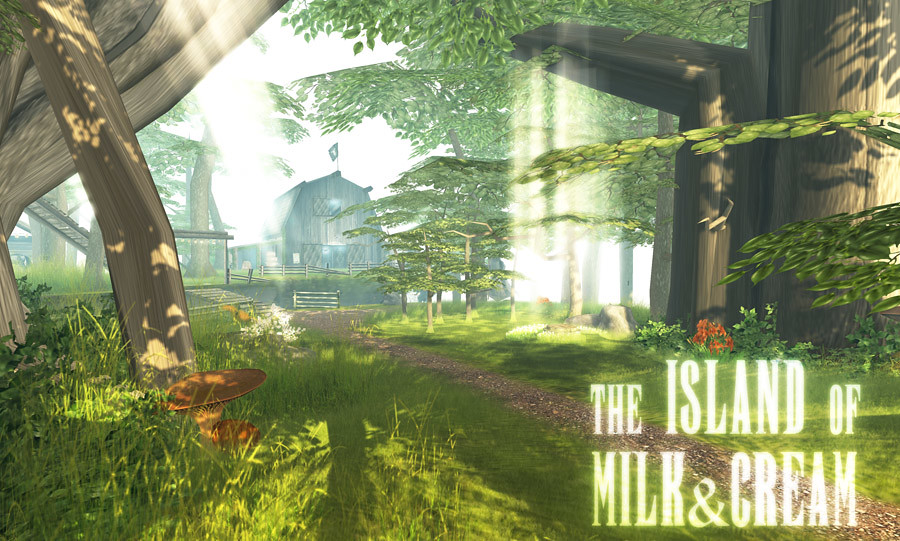 | |
| Aside from the text added to this image, all the screenshots in this article are unedited. |
So, basically I moved up from my tiny 4096 sq.m. (937 prims) tropical farm;
 |
| This is actually a screenshot of the 2048sq.m. farm. I can't seem to find any from after acquiring the neighboring 2048sq.m.parcel. I added a cabana, more beach front and a whole lot more detail. |
A quarter of a sim is a huge amount of space. Most people reduce that to an area that seems only as large as my old 4096 sq.m. parcel. I had Kichi set out enough trees and island pieces that I was able to construct a single large floating island with a bit of landscaping to the surface. Particularly, I wanted to have a river flowing through it which ended in two waterfalls on either side of the island.
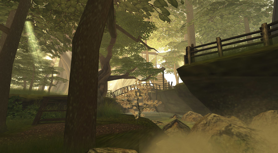 |
| SL can look magnificent with a good build and decent atmospheric shaders. |
 |
| The treehouse entrance is right next to the farm, at one end of the river bridge, making that one of the central gathering places of the island. |
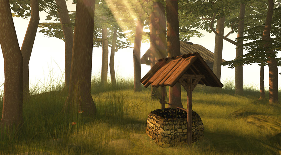 |
| Just a well in a gorgeous forest setting, or is there more to it? |
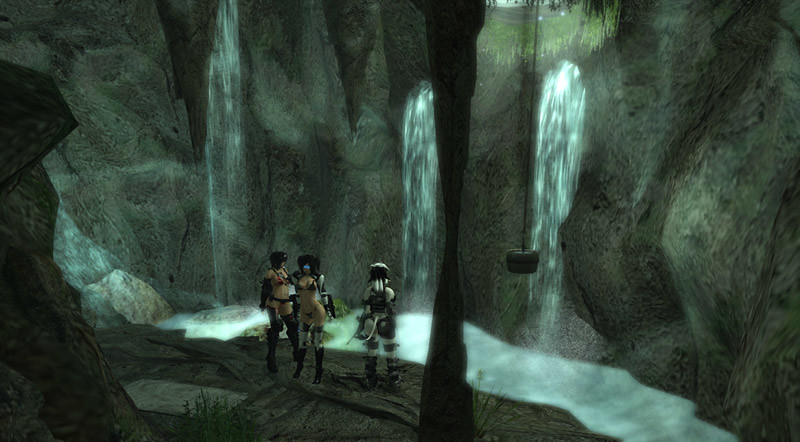
Observant explorers should notice the rickety looking ladders, catwalks and scaffolding leading down along the underside of the island. Those that do will be rewarded with the discovering of the largest of the island's three secret areas. An underground bunker built into caves inside the island itself.
 |
| Originally inspired by locations from the Fallout games, my tiny shop in the Wastelands already has too much going on for this extended bunker area. |
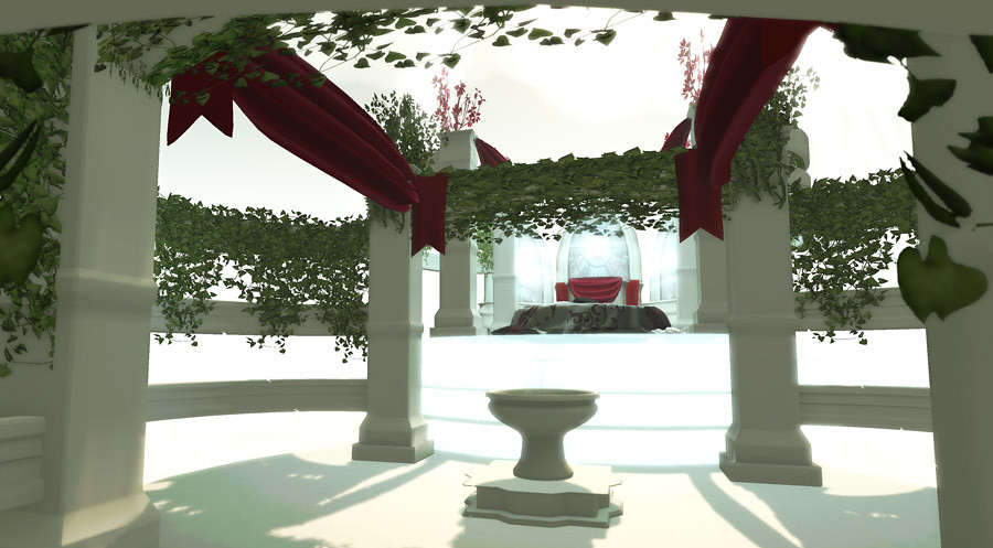 |
| The "Heaven" area is a homage to the previous "Milk and Cream Club", pieces of which we used around the island as "ancient ruins" to investigate. |
Still, the secret areas of the island are rewards for those who do, and fun little building projects for myself. I'm considering releasing some of them as skyboxes or building sets on the marketplace.
In the meantime, the island is coming along nicely and there's already plenty to see and do, even if cowgirls aren't your thing. If you have an SL account, you can visit the island by following the SLURL here.


The island is absolutely stunning, Penny. You've done a really fantastic job. I especially like the ambient and interactive sounds you've put in; they really help bring the visuals even more to life.
ReplyDeleteAre the windlight settings you use available anywhere?
ditto on both. Amazing amazing build! PLease share your settings, pretty please?
ReplyDeleteI'm on a trip right now, away from my desktop computer with all my windlight settings and whatnot, but I'll post my most recent version up for download when I'm home again in a week.
ReplyDeleteI hope now that Estate Level Windlight is becoming a reality that "windlight as inventory" follows soon.